Pie, Treemap, and Donut Charts: Nice to Look at, but ...
Anyone who has built their first Controlling or Finance dashboard has used a pie, treemap, or donut chart at some point. And admittedly: they look great and turn a dashboard into an eye-catcher. They can also replace a slicer and indirectly serve as a filter. A donut chart like the one shown on the right is very commonly seen in dashboards.
Now here comes the big "but": in the first weeks and months after a dashboard goes live, every user is happy to get, for example, the breakdown of revenue by industry displayed nicely each month with minimal effort. However, this changes after just a few months. Even with only two or three categories, users soon lose track of whether, say, the automotive industry made up 17% or 19% of revenue last period.
With more than five categories, pie or donut charts can quickly become hard to read, and individual values may only be legible via mouse-over. If several categories each make up only a very small share, even the mouse-over becomes a challenge. In theory, the highly flexible treemap visual could help here. The problem with this type of visualization, however, is that it gives the report user no visual sense of proportion between the individual values.
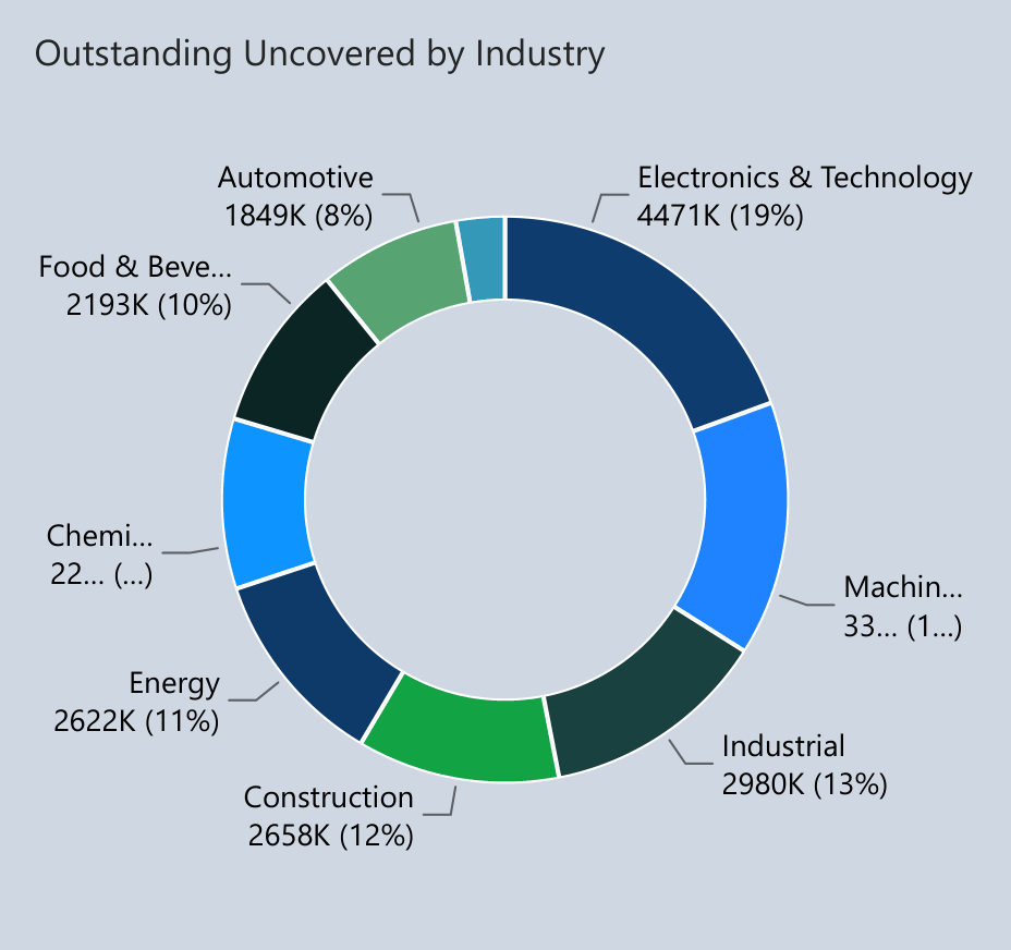
Donut chart – revenue breakdown by industry
How Can This Be Done Better?
The biggest problem with these three types of visualization is the lack of a comparison value. I recommend Zebra BI Charts here. A vertical bar chart, as shown on the right, solves many of these problems.
First, the individual industries are neatly arranged one below the other, so both the industry names and their corresponding values can be read in an organized way. Second, there's a comparison value to a prior period. You can see in absolute figures how each industry has changed compared to the previous month. Third, the share of each industry as a percentage of total revenue is displayed in an organized format. Fourth, you can even see the change in that share of total revenue – this time correctly expressed in percentage points.
Many will probably say that the donut chart in the example above looks visually more appealing and colorful. I can confirm that too. But the goal of a successful dashboard implementation is consistent use by the report's target audience. For that audience, the key information in the example below is far clearer and more organized. That's the only way to take your dashboards to the next level.
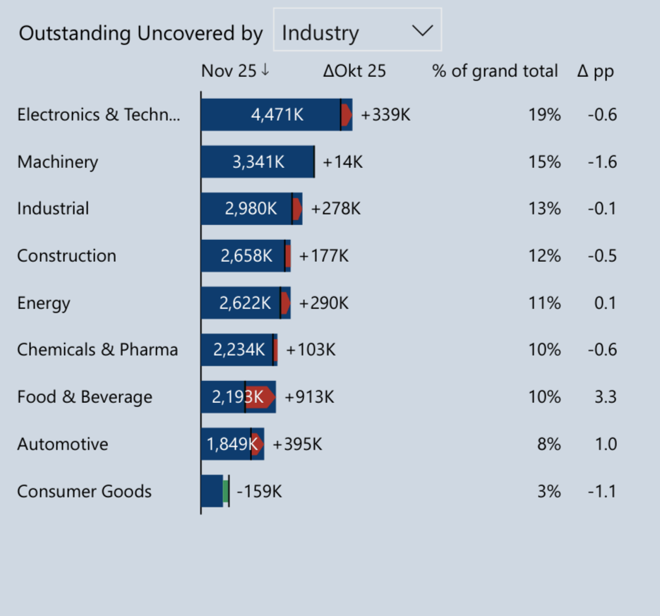
Zebra BI chart – comparison value, change, and share at a glance