The data model is done, the calculations are clean – now we just need to quickly build the visuals and take the report live. Wrong. Power BI dashboard implementations often don't fail because data is unavailable or incorrect. It's the design and user interface that ultimately determines whether a dashboard actually gets used.
Know Your Audience
Is this dashboard page for a board member or a cost center manager, a CFO or a sales rep? Each has completely different requirements when it comes to level of detail, filter options, and visualizations. The most important question before building any page: WHAT does WHO want to see?
Keep the Number of Visuals Low
Depending on the level of detail, 3–5 visualizations per page is a good rule of thumb – anything more feels cluttered and quickly overwhelms users.
Limit Interaction Options
Power BI makes it easy to build countless interaction options: Drill Down, Drill Through, Cross Filtering, Field Parameters. My recommendation: limit them to 2–3. The same goes for dropdown filters – keep them minimal, though always with your audience in mind. Less is almost always more here.
Choose the Right Visualization
There are so many ways to choose the wrong chart type that it deserves its own article. As a starting point: avoid pie and donut charts, stick to a maximum of 2 dimensions per visual, and use as few labels as necessary. The wrong visualization can make a perfectly correct insight completely unreadable.
Always Include Reference Values
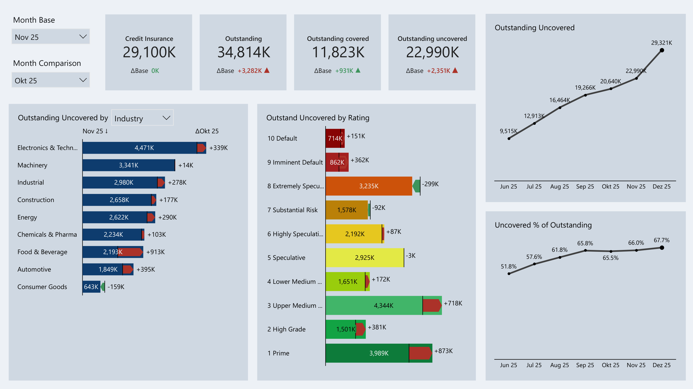
Dashboards without reference values age poorly. At launch, people are usually happy just to see how things are composed. But within 2–3 months, they want numbers in context. Only when comparing against plan, forecast, or prior periods can you really understand why things have changed – and by how much.
A great example is the customer risk analysis dashboard. By using Zebra BI visuals and variable month-over-month comparisons, you can see at a glance whether risk has increased or decreased compared to the previous period.
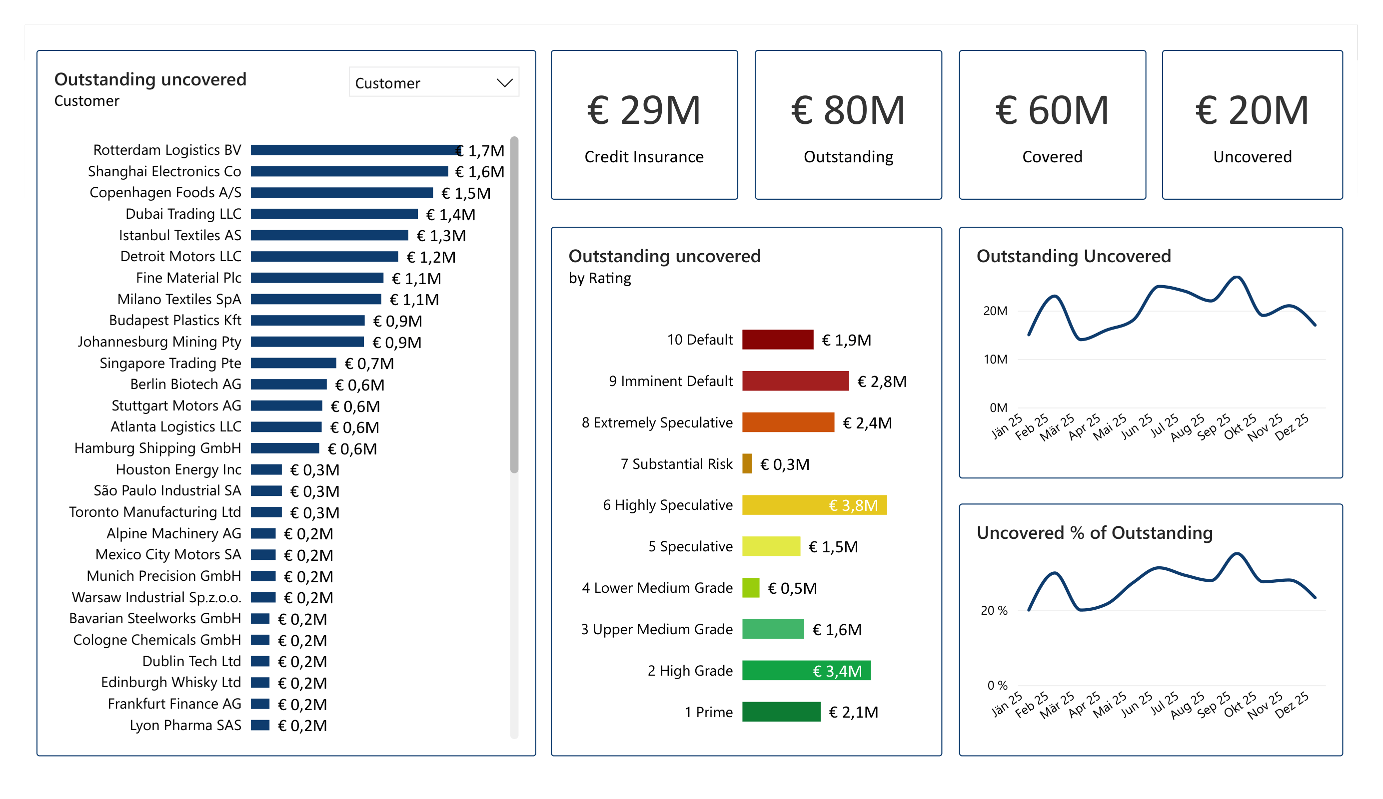
Customer Risk Analysis – without reference values